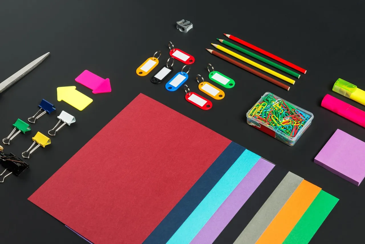
Color is more than just a visual experience; it is a powerful tool in marketing and branding that can affect customer perception and behavior. In the world of e-commerce, the colors you choose for your brand and website can influence how customers feel about your products, how they engage with your content, and whether they decide to make a purchase. This blog dives deep into the psychology of color, analyzes how brand colors influence customer behavior, and provides actionable tips on choosing the right colors for your business.
1. Understanding the Psychology of Color

The psychology of color examines how different hues evoke emotions and perceptions in people. Each color carries a unique set of associations and can elicit specific emotional responses. For instance:
-
Red: Often associated with excitement, passion, and urgency. Red can stimulate the appetite and is frequently used in call-to-action buttons to create a sense of urgency.
-
Blue: Symbolizes trust, stability, and calmness. Many financial institutions and tech companies use blue to convey reliability and security.
-
Green: Represents nature, health, and growth. It is commonly used by brands that focus on sustainability or wellness.
-
Yellow: Evokes feelings of happiness, warmth, and optimism. It grabs attention quickly but can be overwhelming if overused.
-
Black: Conveys sophistication, luxury, and exclusivity. Often used by high-end brands to create a sense of elegance.
-
White: Associated with purity, simplicity, and cleanliness. It is used to create a minimalist and spacious look.
Pro Tip: When selecting your brand colors, think about the emotions you want to evoke in your target audience. Your color choice should align with your brand’s message and values.
2. The Impact of Brand Colors on Customer Perception

Brand colors do more than just make your website look appealing; they play a crucial role in how customers perceive your brand. Studies show that color increases brand recognition by up to 80%. Consistent use of brand colors can create a strong visual identity, making it easier for customers to remember and trust your brand.
Key Insights:
-
Red for Urgency: Retailers often use red for clearance sales or limited-time offers because it creates a sense of urgency.
-
Blue for Trust: Blue is popular among brands in finance, healthcare, and technology because it builds trust and conveys professionalism.
-
Green for Sustainability: Green is frequently used by eco-friendly brands as it represents nature and health, appealing to environmentally conscious customers.
Pro Tip: Use your brand colors consistently across all marketing materials, including your website, social media, packaging, and email campaigns. This helps reinforce your brand identity and builds recognition.
3. How Color Influences Purchasing Decisions

Color is one of the first things customers notice when they visit your website. It affects their mood, attention span, and even their purchasing decisions. In fact, research indicates that 90% of snap judgments made about products can be based on color alone.
Analysis:
-
Conversion Rate Optimization: Changing the color of a call-to-action button can significantly impact click-through rates. For example, red buttons tend to perform better than green buttons when it comes to encouraging quick actions.
-
Impulse Purchases: Bright, bold colors like red and orange are more likely to encourage impulse buying because they create excitement and urgency.
-
Brand Loyalty: Colors that align with the customer’s expectations for a particular industry can enhance brand loyalty. For instance, customers might expect a wellness brand to use calming greens and blues rather than aggressive reds.
Pro Tip: Test different color schemes on your website to see which combinations lead to higher engagement and conversions. A/B testing is an effective way to determine the best color choices for your audience.
4. Cultural Differences in Color Perception

Color perceptions can vary widely across cultures. What might be seen as positive in one country could have a completely different meaning elsewhere. Understanding these cultural differences is essential for businesses looking to expand internationally.
Examples:
-
White: In Western cultures, white is often associated with purity and weddings. However, in some Asian cultures, white is linked to mourning and funerals.
-
Yellow: In Western countries, yellow is seen as cheerful and bright, but in parts of Latin America, it may symbolize jealousy.
-
Purple: Purple is traditionally associated with royalty and luxury in many cultures, but in Thailand, it is linked to mourning.
Pro Tip: When designing a global marketing campaign, research the cultural significance of your chosen colors in your target markets to avoid unintended negative associations.
5. Choosing the Right Colors for Your Brand
Selecting the right color palette for your brand is a strategic decision that should align with your brand’s personality, industry, and target audience. Here’s a step-by-step guide to help you choose:
Step 1: Define Your Brand Personality
-
Is your brand playful or serious? Luxurious or affordable? Your brand’s personality will influence your color choices.
Step 2: Consider Your Target Audience
-
Think about the demographics of your target audience, such as age, gender, and cultural background. Different groups respond differently to colors.
Step 3: Research Your Industry
-
Look at your competitors and industry leaders. Identify common color trends, but also think about how you can differentiate your brand.
Step 4: Create a Color Palette
-
Choose a primary color that represents your brand’s core values, and then select complementary colors for accents and highlights.
Step 5: Test Your Color Choices
-
Conduct A/B testing with different color schemes to see which resonates best with your audience and drives the most engagement.
Pro Tip: Use online tools like Adobe Color or Coolors.co to experiment with different palettes and find the perfect combination for your brand.
6. Applying Brand Colors to Your E-commerce Store

Once you’ve chosen your brand colors, it’s essential to apply them effectively across your e-commerce store. The right use of color can enhance user experience, guide customer behavior, and increase sales.
Tips for Application:
-
Homepage: Use your primary brand color for key elements like the logo, headers, and call-to-action buttons.
-
Product Pages: Highlight discounts or special offers with contrasting colors to draw attention.
-
Checkout Page: Opt for calming, neutral colors that reassure customers and reduce cart abandonment.
Pro Tip: Maintain color consistency throughout your site to create a cohesive brand experience and avoid confusing your customers.
Conclusion: The Power of Color in Branding
Choosing the right colors for your brand isn’t just about aesthetics—it’s a strategic decision that can influence customer perception, engagement, and purchasing behavior. By understanding the psychology of color, considering cultural differences, and testing your choices, you can create a color palette that resonates with your audience and strengthens your brand identity.
Whether you are launching a new brand or refreshing your current look, remember that the right colors can be a powerful asset in your marketing toolkit. Use color strategically to tell your brand story, evoke the desired emotions, and ultimately drive sales.
Ready to harness the power of color in your branding strategy? Start experimenting with different palettes and watch as your brand’s presence and customer engagement grow!


