In the competitive world of e-commerce, every interaction with a potential customer counts. A well-designed contact form serves as a crucial bridge between your business and potential clients, facilitating inquiries, feedback, and support requests. According to Mailchimp, contact forms are essential for building trust and establishing brand identity. Industry data reinforces their importance: 84% of marketers rely on form submissions to generate leads, while nearly half (49.7%) report web forms as their top-converting lead source (FormStory, 2024). However, merely having a contact form is not sufficient; customizing it thoughtfully can significantly enhance user engagement and conversion rates.
The Zotabox team has come up with seven actionable tips to help e-commerce merchants create contact forms that truly make an impact—boosting engagement, improving user experience, and driving more conversions. To put these strategies into action with ease, the Zotabox Contact Form Builder app is here to support you every step of the way, offering a seamless solution for building and customizing high-performing forms tailored to your brand.
1. Strategic Form Placement: Make Visibility a Priority
One of the most important—yet often overlooked—factors in form optimization is where your contact form appears on your website. Even the best-designed form can underperform if it’s buried in hard-to-find sections or placed too far down the page. A contact form’s primary goal is to encourage communication, so it should be both visible and easily accessible without disrupting the user experience.
Actionable Tip: To maximize engagement and less intrusive access, consider placing it as a slide-out tab or sticky widget in the sidebar, ensuring it stays present but doesn’t interrupt the user journey. This balance between visibility and UX is key to driving more form submissions while maintaining a clean, navigable layout.
2. Tailor the Design to Purpose and Keep It Streamlined
Once your contact form is placed in a visible location, the next critical step is ensuring it aligns with its purpose and remains user-friendly. Whether you're collecting customer feedback, handling inquiries, or offering support, the format of your form should reflect its goal. However, one principle applies across all use cases: Keep it clear and simple.
Overloading your form with too many fields or irrelevant questions can discourage users from completing it. Studies indicate that forms with fewer fields tend to have higher conversion rates. Forms can be designed to have three to five fields—just enough to collect key information without overwhelming the visitor.

Actionable Tip: Begin by identifying the core purpose of your form. If it’s a general inquiry, request only essential details like Name, Email, and a Message field. For feedback or product issues, you can add a dropdown selector or checkbox to categorize the inquiry—but avoid going beyond what’s necessary. This minimizes confusion and improves the accuracy and speed of submissions, ultimately improving the user experience and response rates.
3. Design a Clear and Action-Oriented CTA
The Call-to-Action (CTA) button is more than just a submission tool—it’s the final nudge that prompts users to complete the process. A vague or poorly designed CTA can undermine even the most well-placed, user-friendly forms. That’s why it’s crucial to use language that inspires confidence and action.
Opt for specific wording that communicates what the user is about to do—such as “Send Your Message”, “Request Support”, or “Get a Free Quote.” These phrases create clarity and align with the user’s intent.

Actionable Tip: Choose a button label that reflects the outcome of the action and use a high-contrast color that stands out against your site’s background. This not only draws attention but also improves accessibility.
4. Align the Contact Form with Your Brand Identity
Your contact form shouldn’t feel like a separate component—it should function as a natural extension of your website. Integrating your brand’s visual language into the form design not only enhances aesthetics but also fosters trust and familiarity. When users see familiar brand cues—like your logo, color palette, or font style—they’re more likely to feel secure in sharing their information.
Beyond appearance, consistency in tone and messaging within form instructions or placeholder text contributes to a unified brand experience. This subtle reinforcement of your brand values through every element of the form helps create a more polished and credible impression.
Actionable Tip: Match your form’s style to your site’s design by incorporating your brand’s colors, logo, and typography. Ensure the tone of your CTA and form copy reflects your overall voice—whether it’s friendly, professional, or playful—to maintain a seamless user experience.
5. Improve User Experience with Smart Validation and Feedback
Form submission should be a smooth process—not a frustrating one. Proactive error handling and clear confirmation messages can significantly enhance the user's experience. Instead of waiting until a user hits "submit," real-time validation helps catch mistakes as they happen. This not only saves time but also ensures more accurate data collection.
Error prompts should be specific and supportive. Generic messages like “Invalid input” offer little guidance, whereas something like “Please enter a valid email address” makes it easy to correct the issue. Similarly, once the form is submitted, a clear confirmation message or redirection to a thank-you page reassures users that their message was received and sets expectations for what happens next.
6. Ensure Mobile Responsiveness/Optimize for Mobile Devices
In today’s mobile-first environment, ensuring that your contact forms are fully optimized for smartphones and tablets is essential. A poorly rendered form can lead to user frustration and abandoned inquiries. Responsive forms that adapt to various screen sizes not only improve usability but also build trust with mobile shoppers who expect a smooth browsing experience.
Instead of cramming multiple fields into limited space, use a clean, single-column layout that flows naturally on smaller screens. Ensure all interactive elements—such as buttons and text fields—are large enough to tap easily without errors. This simple adjustment can significantly reduce bounce rates and improve submission success.

Actionable Tip: Design your contact form with mobile users in mind by maintaining a vertical flow, minimizing field count, and ensuring touch-friendly spacing between elements.
7. Monitor Performance and Continuously Optimize
Creating an effective contact form doesn’t stop at setup—it requires ongoing evaluation to ensure it continues to meet user expectations and business goals. Leverage form analytics to observe metrics like submission volume, bounce rates, and average completion time. Testing variations in layout, copy, or CTA wording—through A/B testing—can reveal subtle design elements that either help or hinder user engagement. These data-driven insights are invaluable for refining your form’s design and improving conversion outcomes.

Actionable Tip: Use built-in analytics or third-party tools to monitor how users interact with your form. Based on the data, experiment with different layouts or messaging, and iteratively optimize for better results.
Why Choose Zotabox Contact Form Builder
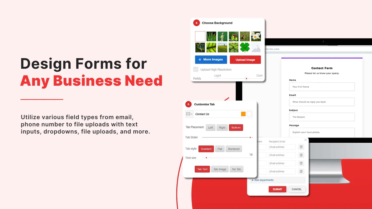
Zotabox Contact Form Builder is designed to help e-commerce merchants create high-performing forms with ease. Its drag-and-drop interface lets you simplify fields, optimize layout, and maintain mobile responsiveness—all essential for a smooth user experience.
This app combines ease of use with powerful customization features that align seamlessly with the best practices we’ve explored:
-
Pre-designed Templates: Choose from professional templates that follow UX best practices for strategic placement and clear formatting—helping you get started quickly while maintaining high performance standards.
-
Custom Styling Options: Tailor the look and feel of your form to match your brand with customizable colors, fonts, and CTA buttons—ensuring design consistency and boosting user trust.
-
Mobile Responsiveness: Every form is automatically optimized for smartphones and tablets, maintaining usability and clean layouts across devices without additional effort.
-
Analytics & Performance Tracking: Easily review submission statistics to evaluate performance, test different form variations, and make informed updates to improve results over time.

With these powerful features, Zotabox Contact Form Builder empowers merchants to build contact forms that are not only visually appealing but also strategically designed to drive conversions and foster meaningful customer engagement.
Conclusion
A well-designed contact form is more than just a means for users to reach out; it's a strategic tool that can enhance user experience, build trust, and drive conversions. By implementing these seven tips and leveraging tools like the Zotabox Contact Form Builder app, Shopify merchants can create impactful contact forms that contribute to their business's success.
Start optimizing your contact forms today and experience the difference it can make in your e-commerce journey!


