Where Knowledge Meets Innovation
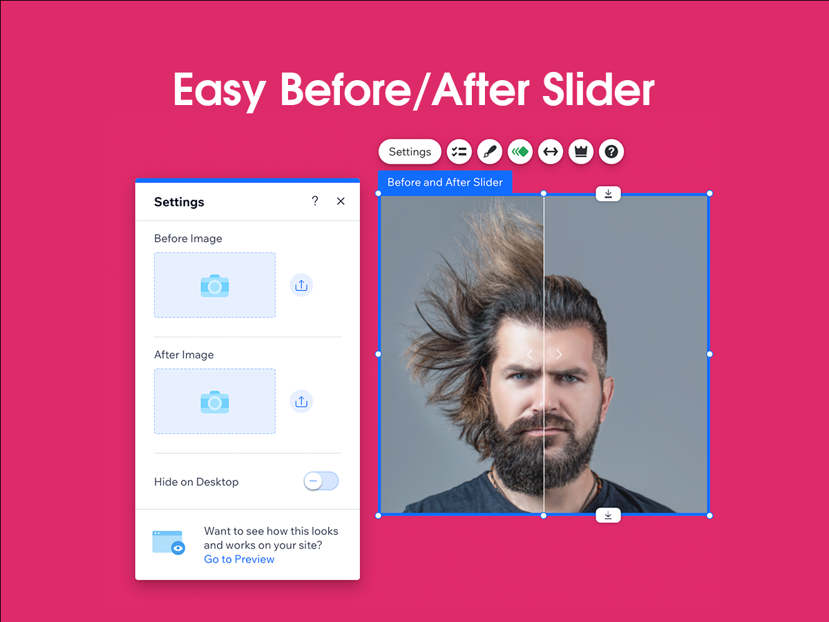
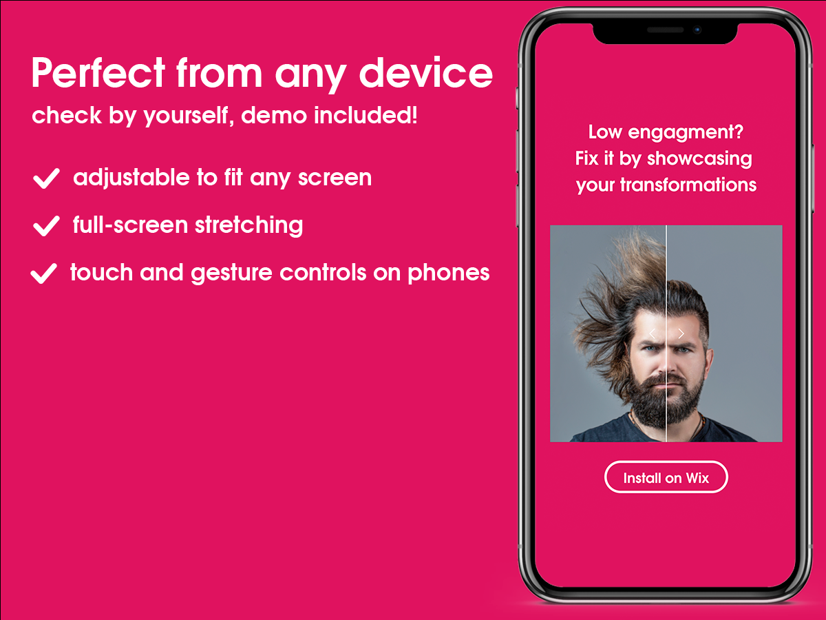
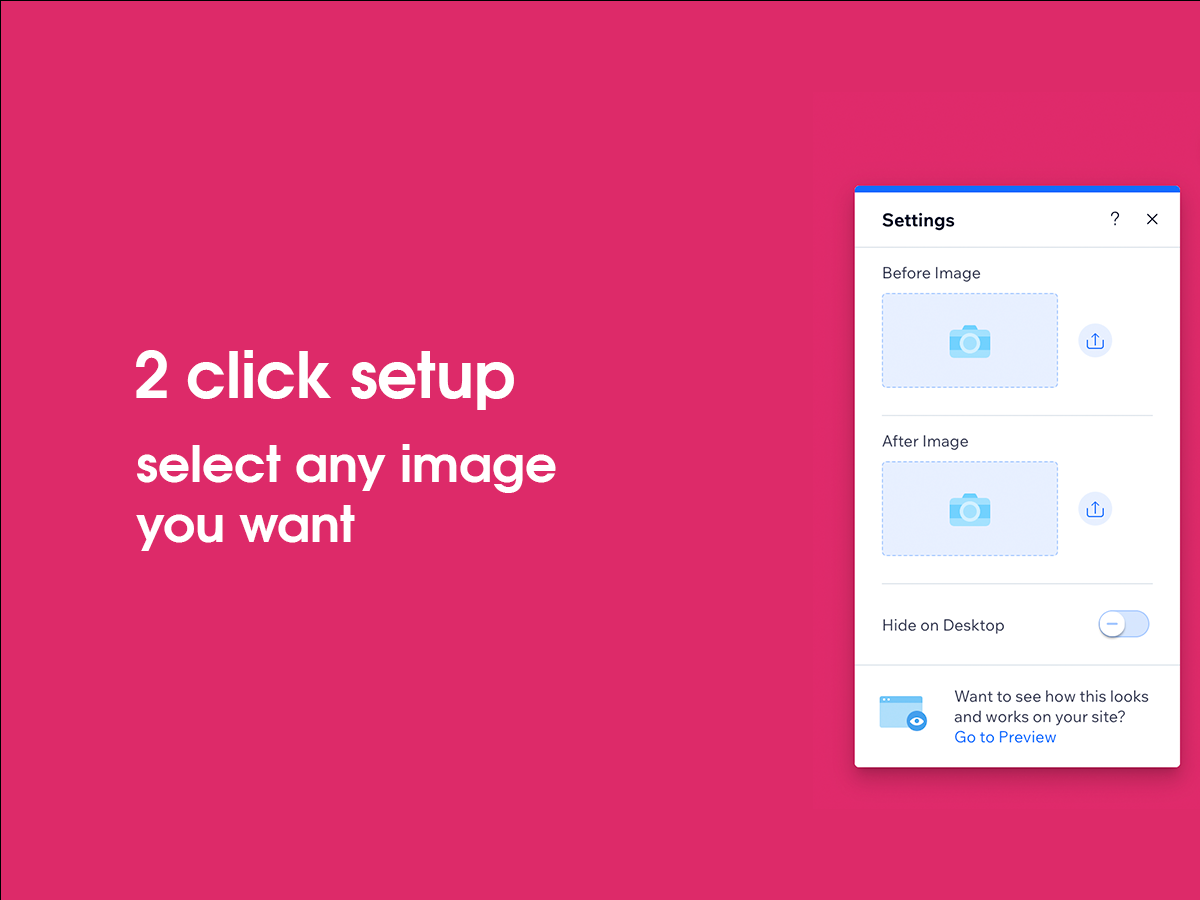
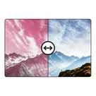
Effortlessly compare images with a fast, customizable slider on any device.
Categories
Easily display transformations with customizable, interactive...
"Create dynamic, engaging web sections with interactive...
Effortlessly showcase transformations with customizable...
Visualize changes with interactive before and after image...
Seamless video editing with dynamic transitions and effects....
Effortlessly compare images, showcase transformations, engage...
Experience immersive 3D animations reflecting seasonal changes....
 Shopify Apps
 Ecwid Apps
 BigCommerce Apps
 AI Agents